Of course, this is a simplified, cultural view of a broader market transition. The shift was also driven by economic factors, brand value, and overall business development, all of which pointed in the same direction. At a certain point, the transition felt inevitable, and a crucial part of it was a significant change in how we presented ourselves in external comms. Further goes some commercial poetry — this is normal.


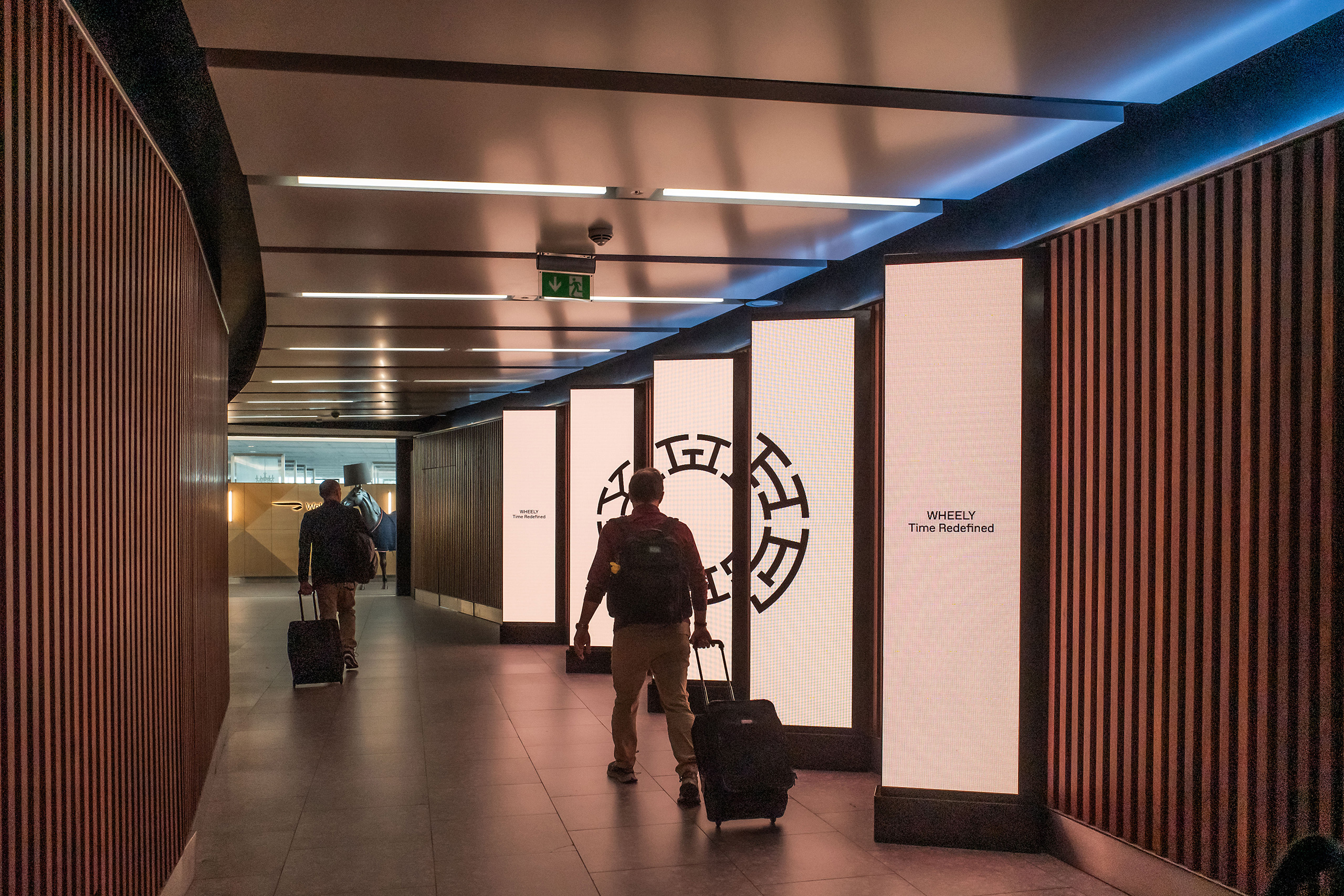
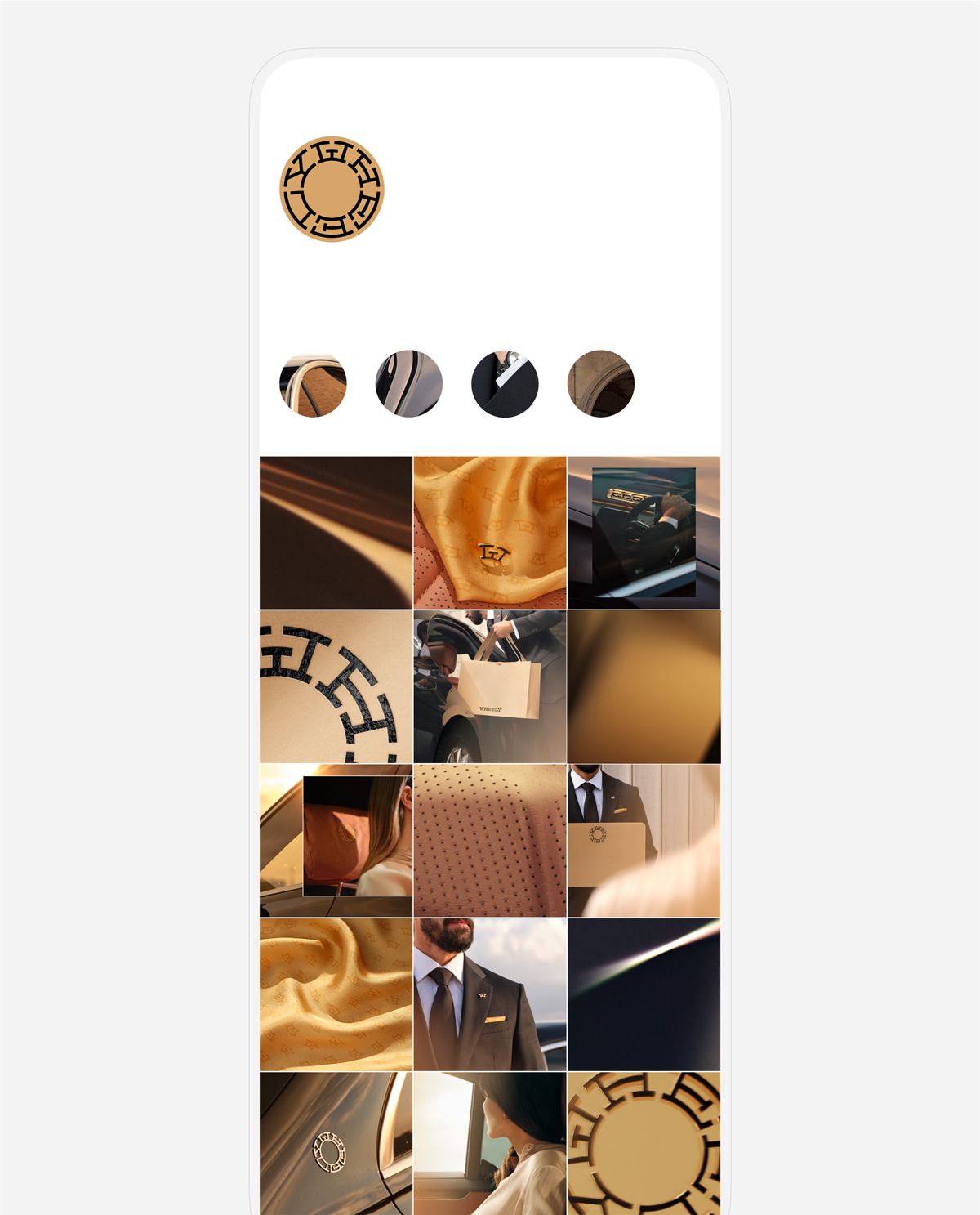
Once we established the fortress-like Wheel of Time logo and sandstone as universal, timeless anchors, we moved into a more expressive visual language around time itself. Not urgency, but observation. Calm moments where time is felt rather than chased. The visuals hold on to small, complete moments. Stillness, light, breath between actions. Time appears with a sense of grace, measured in seconds that don’t ask to be spent efficiently, only consciously. This calm runs through the photography, graphics, and typography as a quiet promise: time used without friction, without emotional leakage. Not something that drains you, but something that gives composure back.

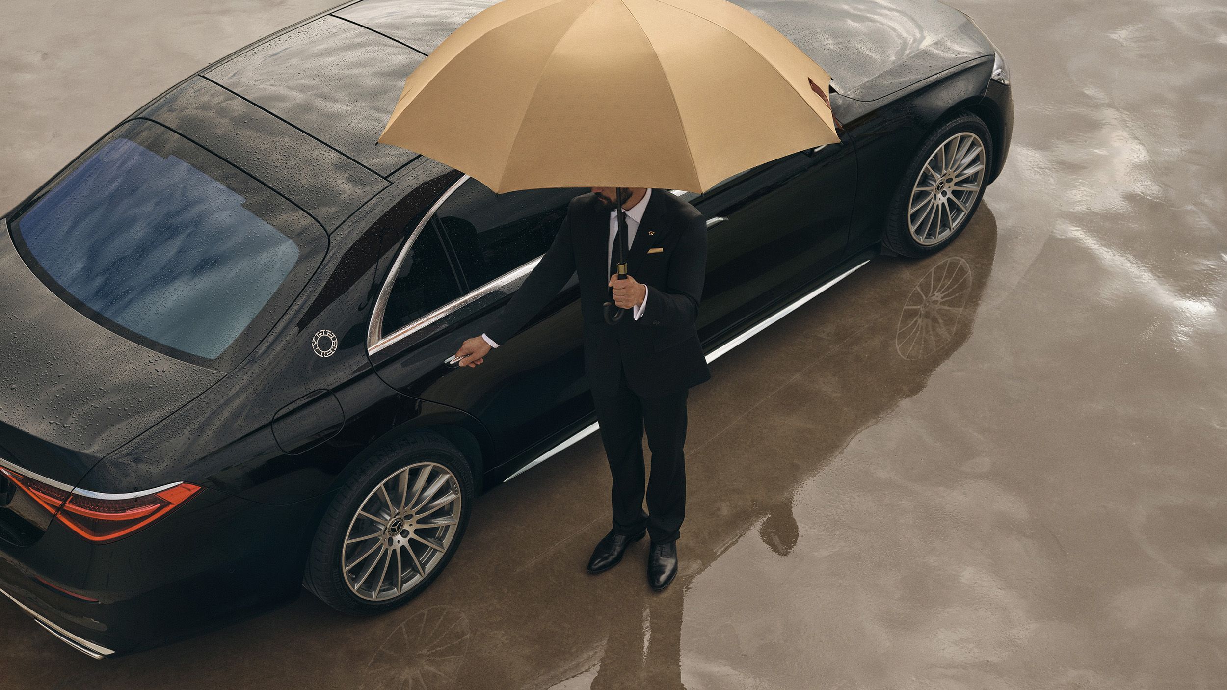
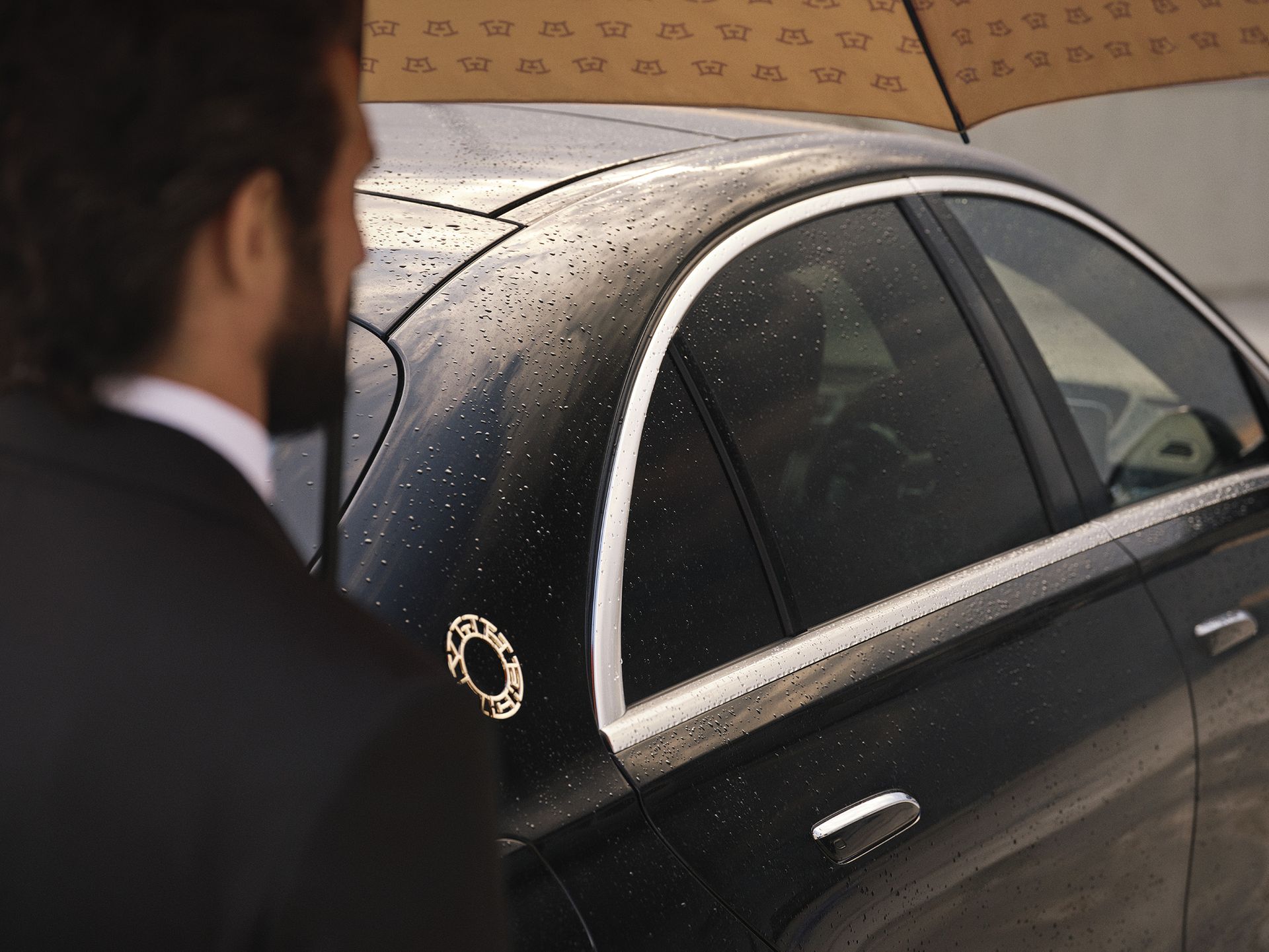
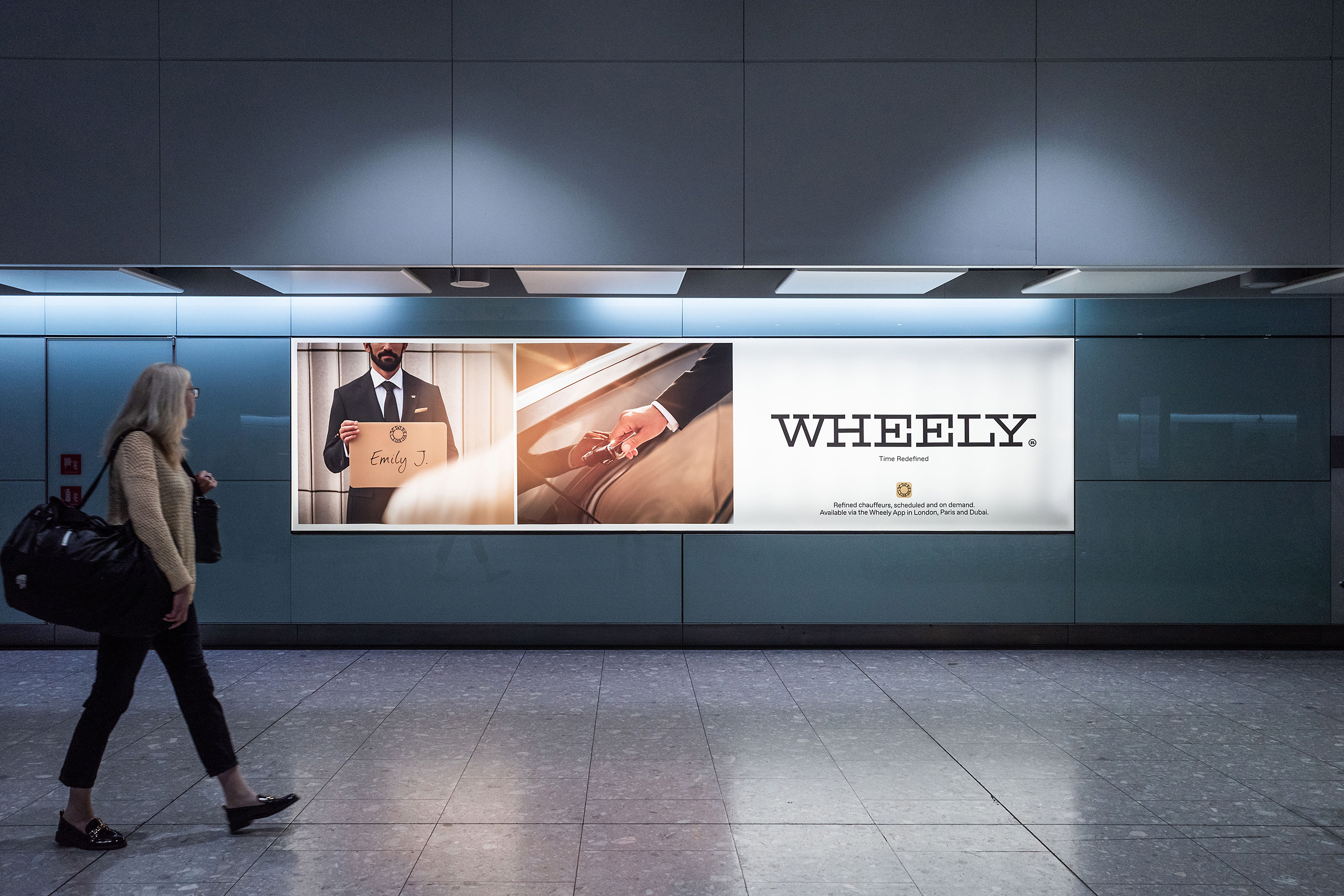
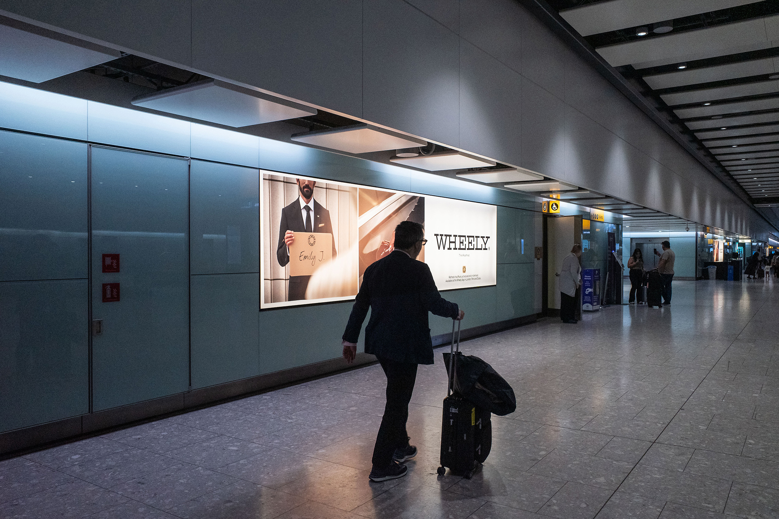
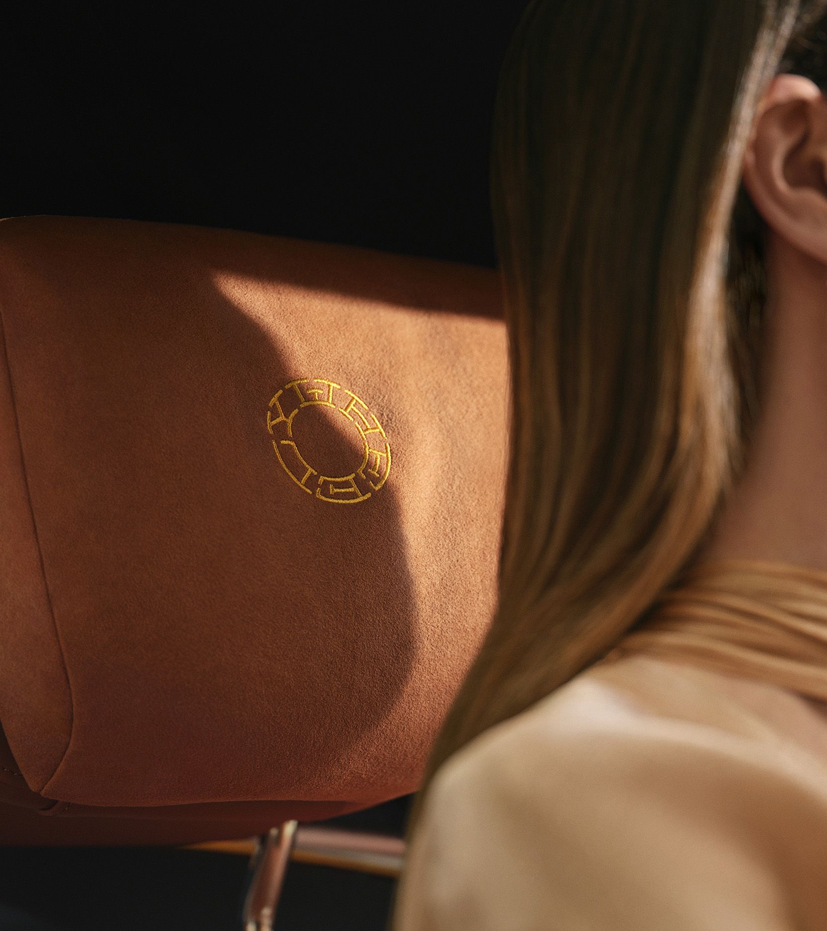
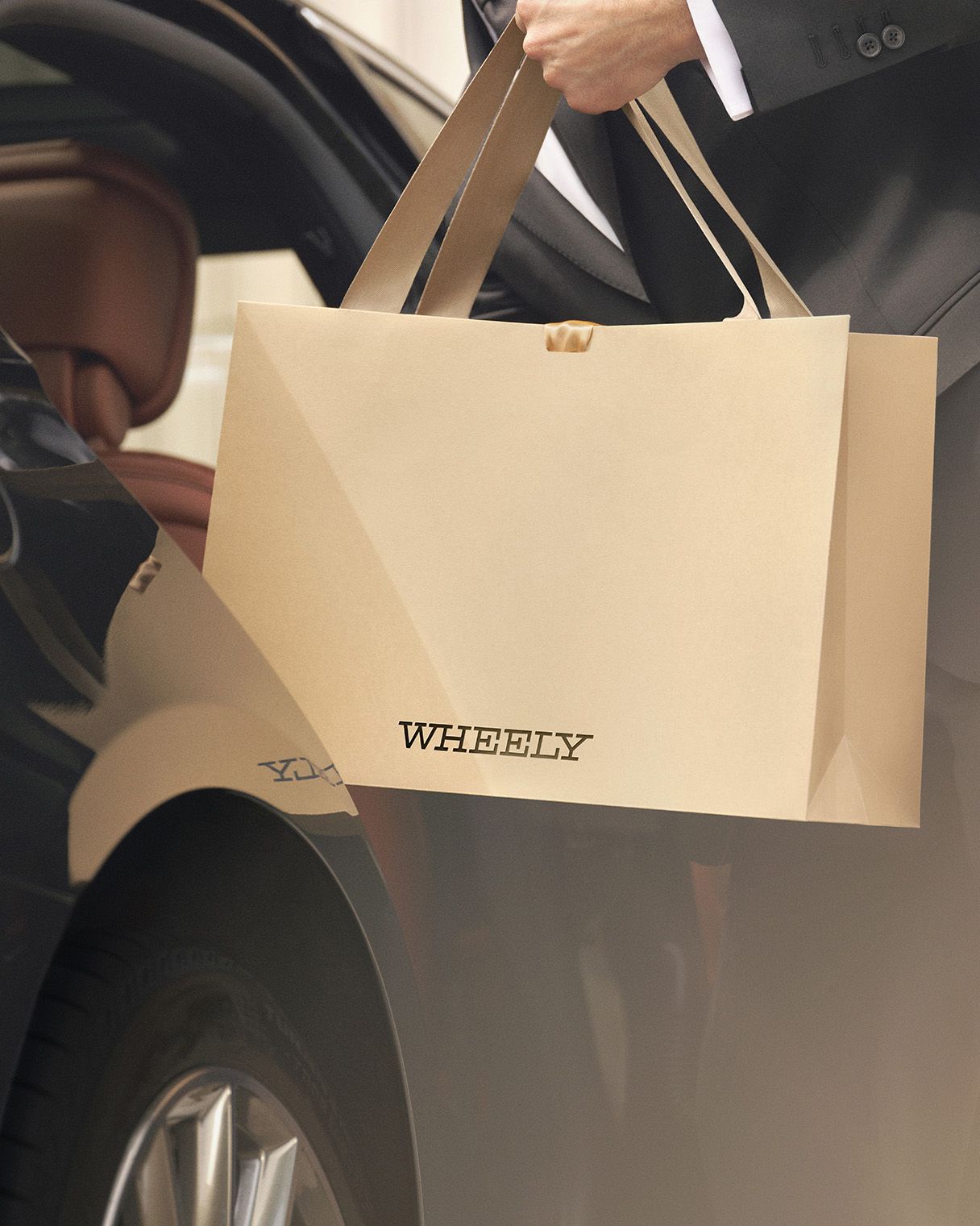
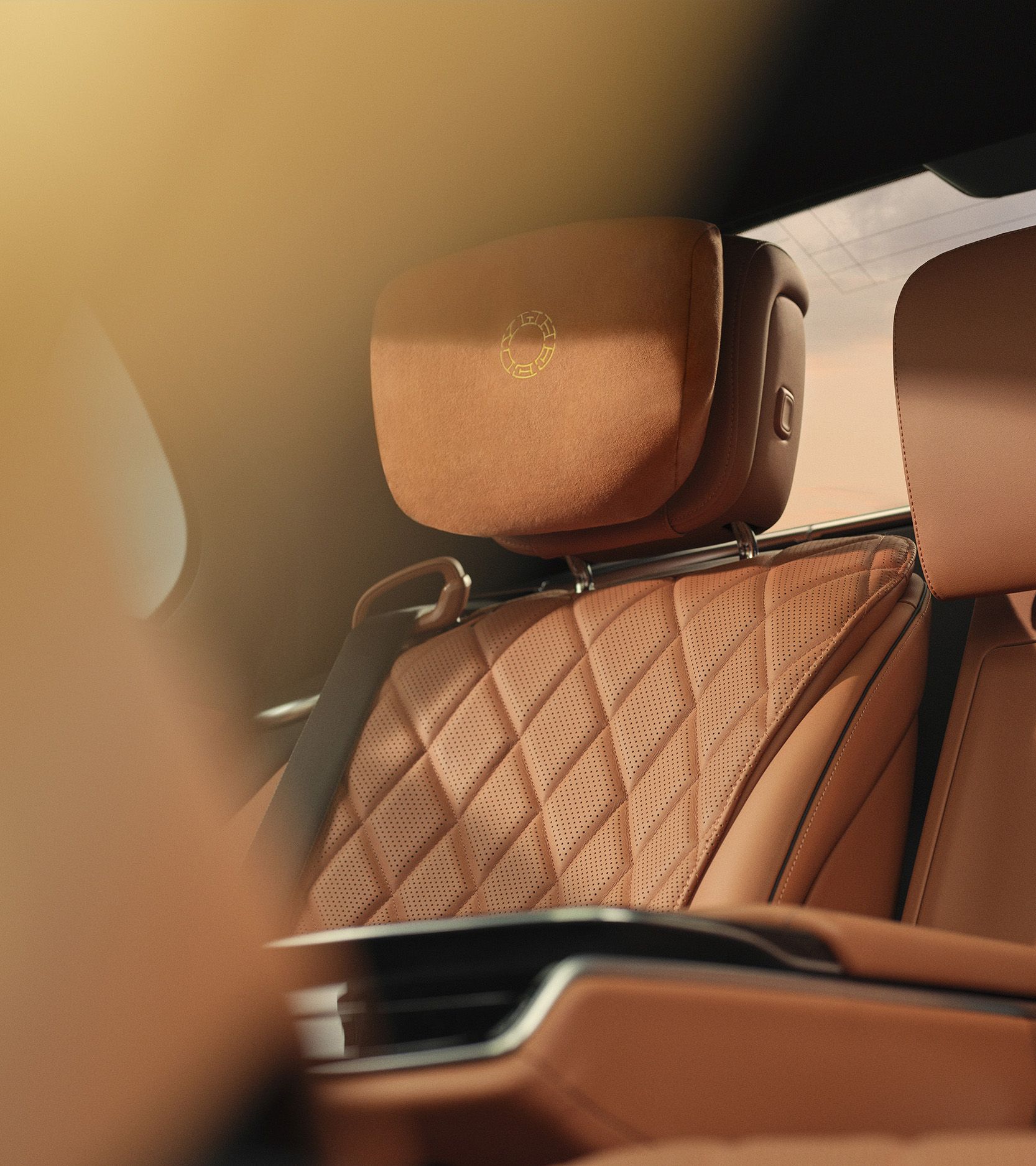
This phase was about expressing personality without losing restraint. Remaining subtle, yet clearly present. The brand becomes an invitation rather than a declaration, allowing clients to identify with it. Branded elements of chauffeur attire and vehicle exterior sit naturally on top of the classic chauffeured Mercedes service, acting as quiet markers of our promise and as references to the app — a distinct take on ride-hailing.


We were influenced by the photographic language Luke Evans brought in, where it’s unclear whether you’re seeing matter, light, or passage itself. From there, we explored how time could be visualized if it behaved like liquid, gas, light, or dust. With the help of visual artist Elena Charobay, we developed a set of abstract visuals that function as a visual tone of voice, used when Wheely speaks in a more poetic, philosophical register.
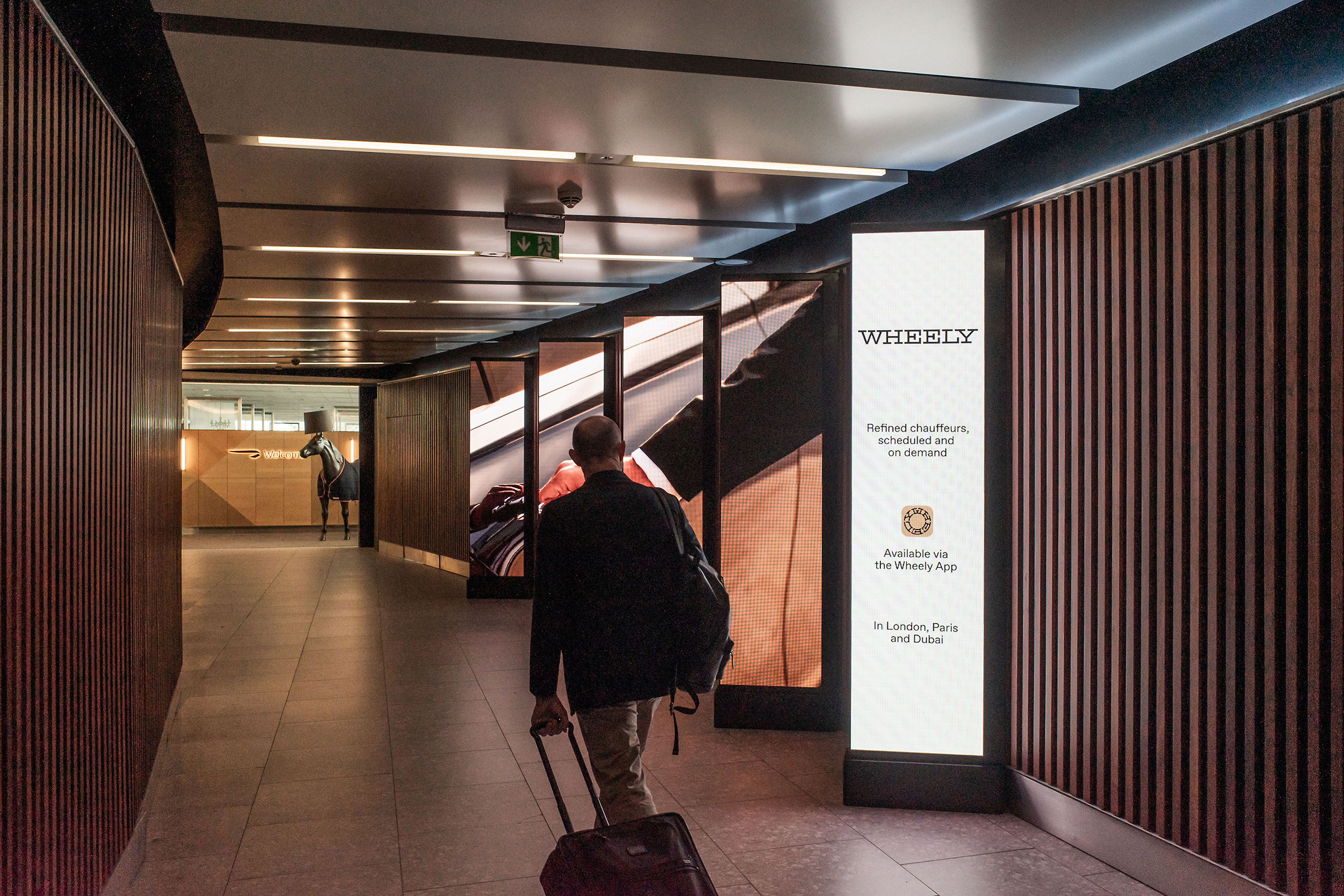
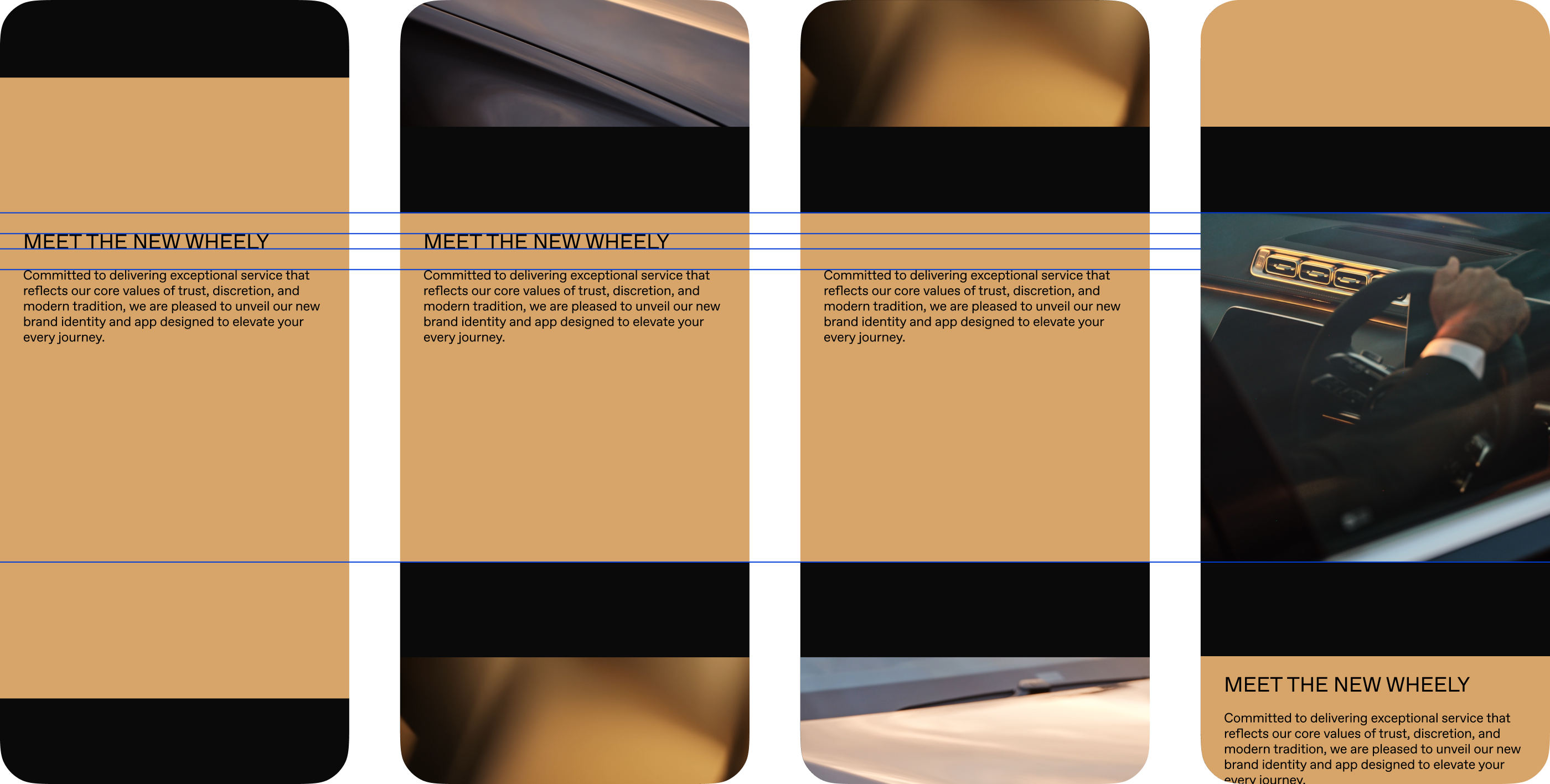
The goal of digital communications of the rebranding was to establish and reinforce that this is who Wheely is now. Calm, self-assured, and dignified, without self-glorification. Typography leaned modern, with occasional references to timeless stone signage. (We talk about chauffeuring, but from a contemporary position.) The system included pragmatic announcement templates and clean awareness ads, designed to feel confident rather than persuasive.

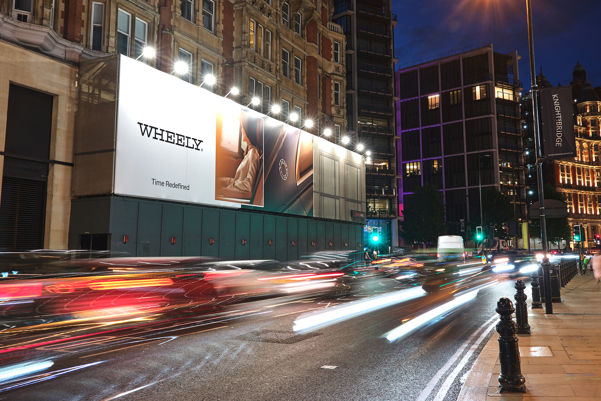
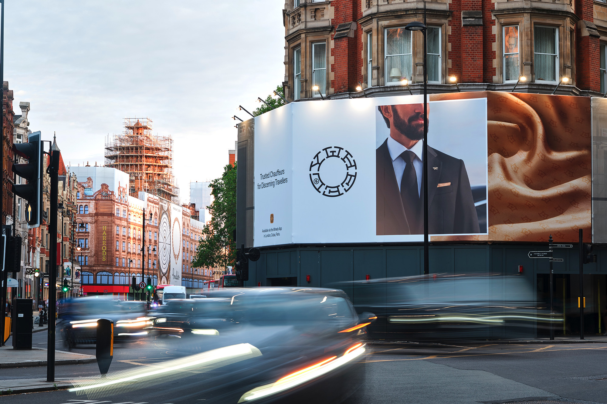
With the Perfect Airport Pickup feature already in place, it made sense to commit more visibly to selected airports. This opened an opportunity to create a restrained, immersive advertising experience along the path to premium lounges, staying present without demanding attention.