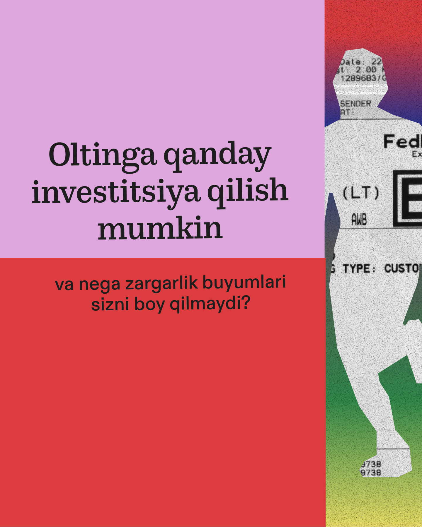
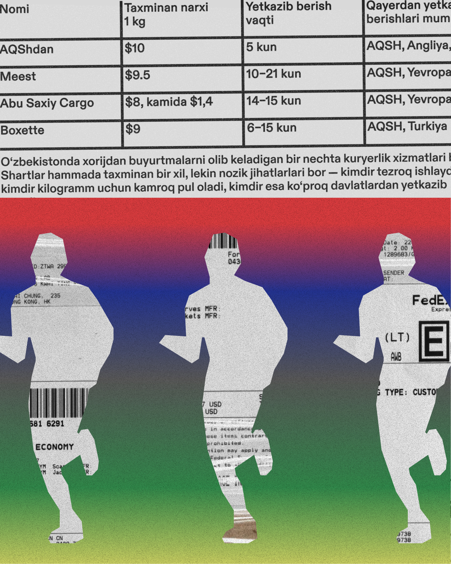
Nechpul means “How much?”, a phrase heard daily across Uzbekistan: in stores, in marketplaces, on staircases, everywhere. It is an agent of everyday exchange around financial information, just like NECHPUL itself. The challenge from the editorial team was to include every kind of Uzbekistani in the conversation about money, from progressive capital city dwellers to watermelon farmers in distant regions. I couldn’t be happier to celebrate the simple things that unite people.
⓪
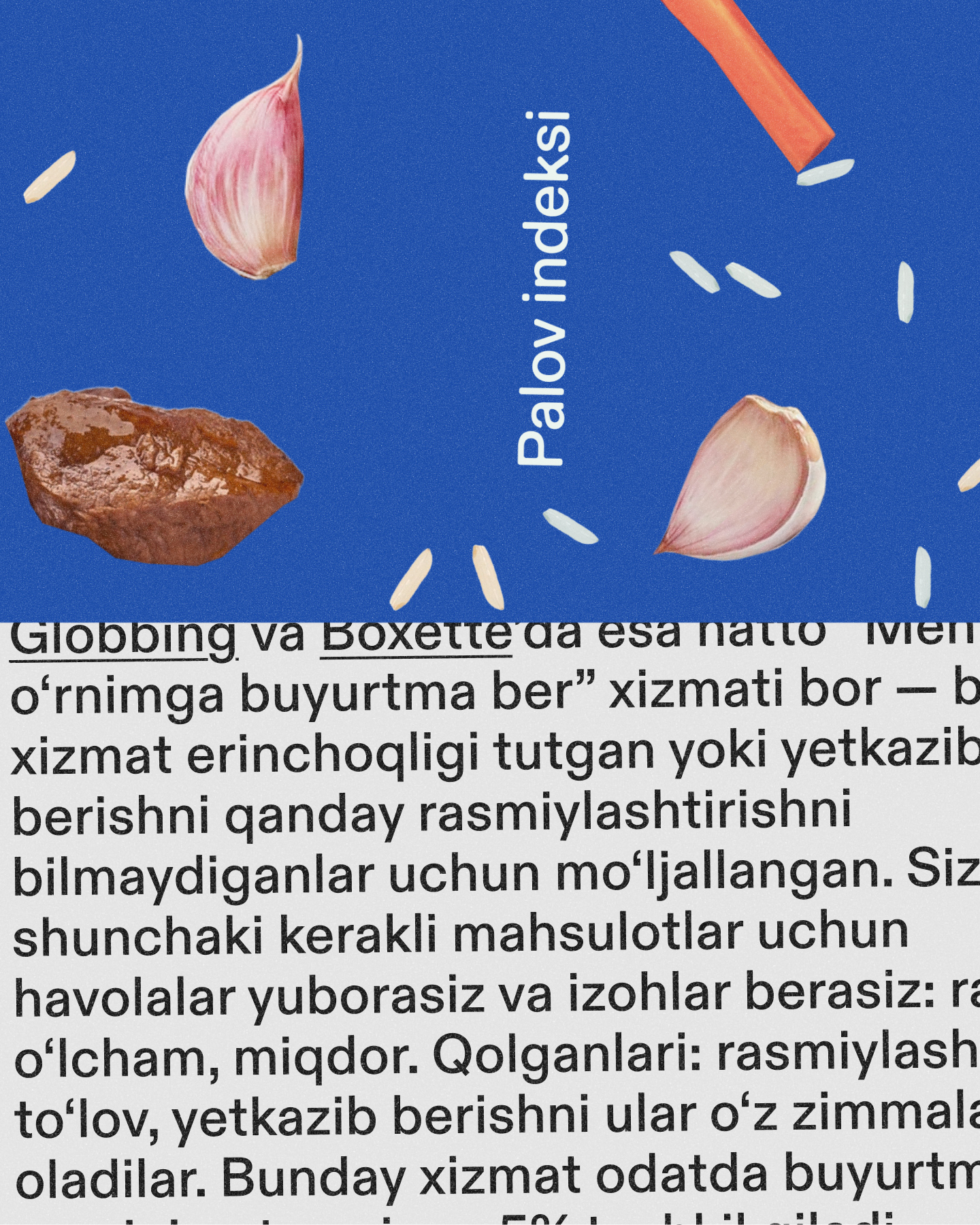
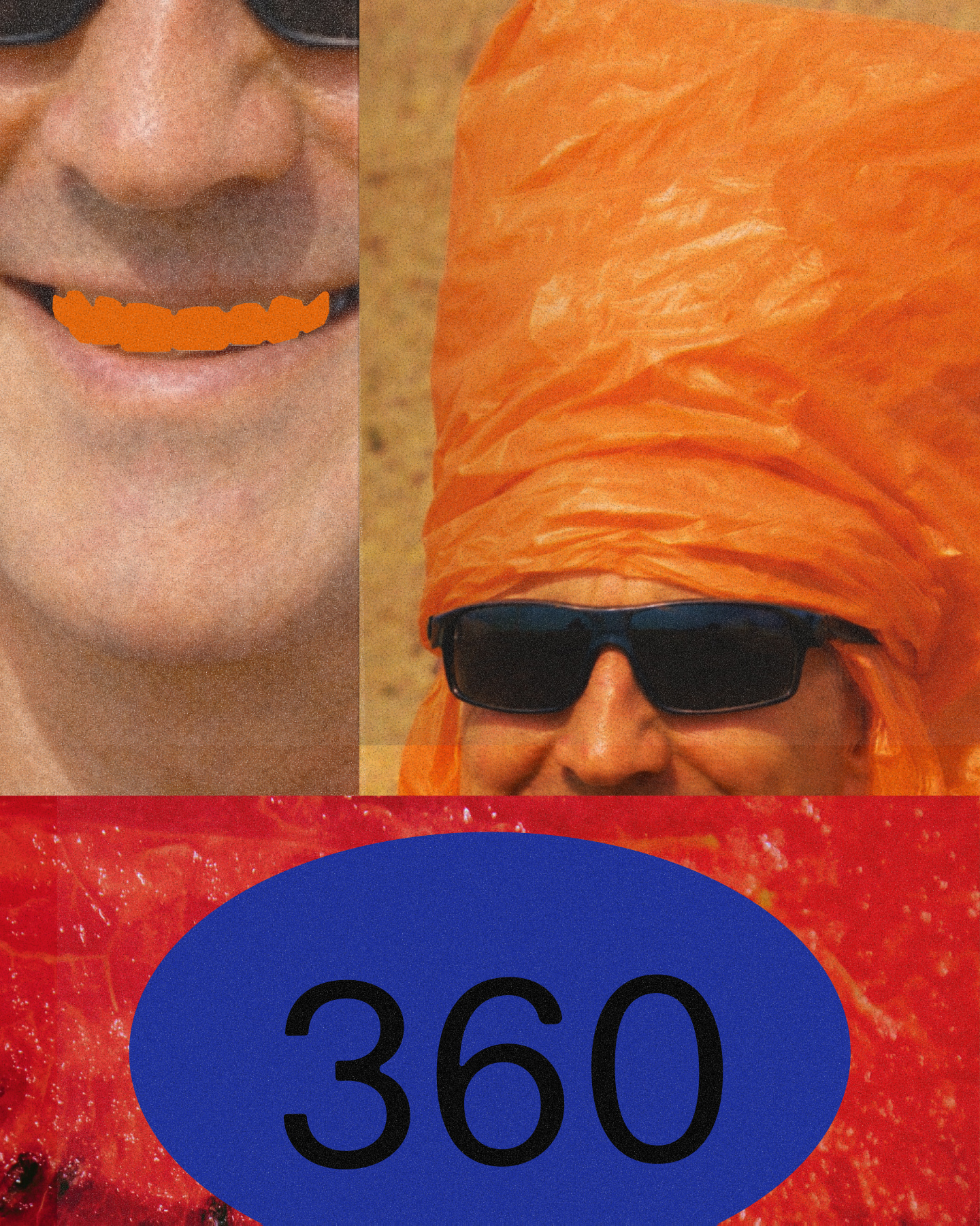
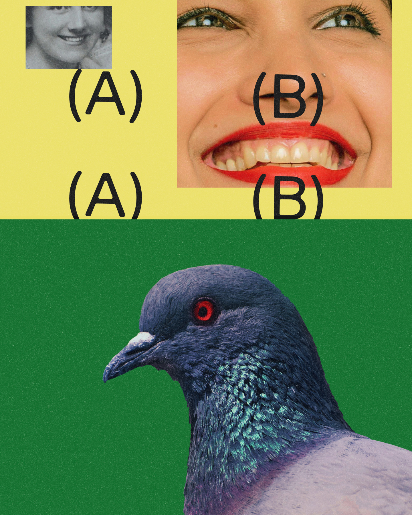
I was working with universal elements that are often perceived as local. People tend to think that hospitality, family bonds, and Sunday barbecues are unique to their own culture. In the same way, simple utilitarian objects like price tags, binders, stairwell wall paint, and plastic baskets feel deeply tied to everyday life and therefore “local.” This sits outside tourist exoticism or ceremonial traditions. It’s just people’s stuff.
①
The approach to breaking down concepts was borrowed from Vox documentaries, where a subject is dissected on an imaginary cutting mat, pragmatic but always approachable. The utilitarian tone comes from Rekki’s visual language, particularly their use of plastic storage containers as color references. The nod to consumer culture is drawn from Toilet Paper magazine, but without its radical social critique. NECHPUL keeps the visuals bold while staying firmly grounded in calm, okay vibes.
②
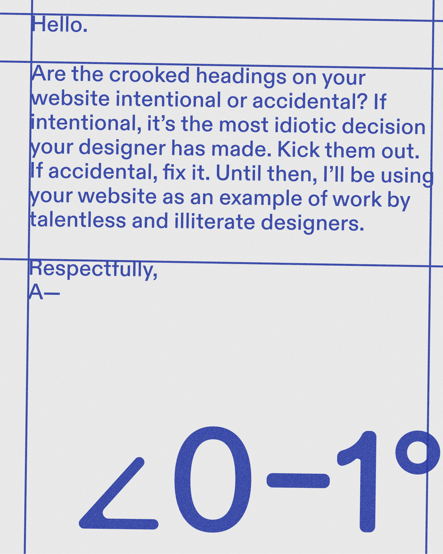
Clean, aligned, and flawless is not how everyday affairs actually work here. NECHPUL offers a humble alternative to xoladan so‘rash, the familiar habit of asking an aunt, neighbor, or mahalla elder for advice. It’s a conversation between people who can relate to each other, people who store cash between the layers of kurpacha blankets. The 0°–1° text tilt is the key device used to introduce believable, moderate sloppiness, suggesting something placed by a real person rather than enforced by corporate standards.
③
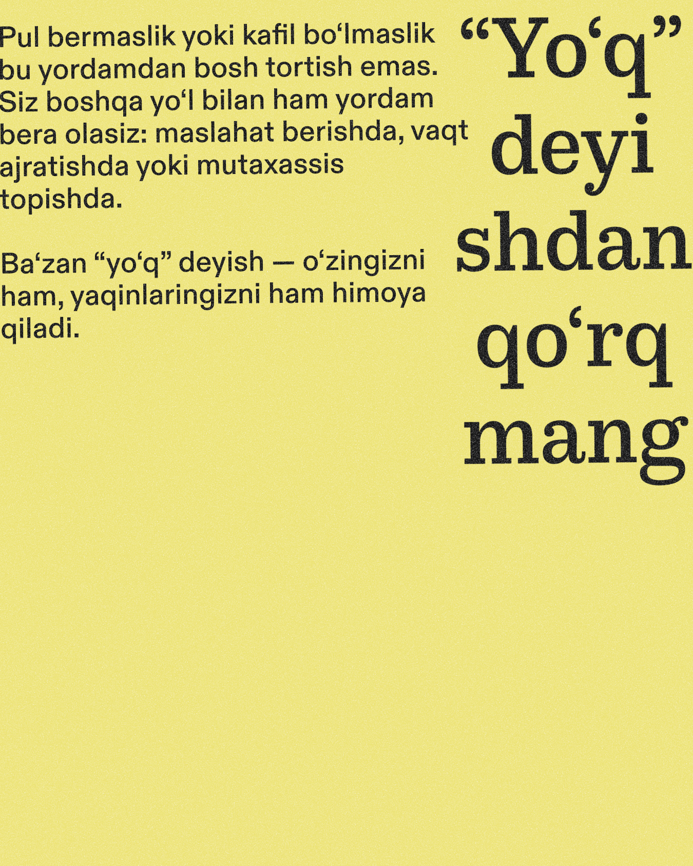
We took into consideration the concept of oyga qarab havas qilmoq. There is a natural tension when it comes to discussing personal financial matters. NECHPUL approaches this openly and playfully, easing the discomfort rather than denying it. That’s where the energy comes from. At the same time, it never pushes too far or crosses boundaries. Uzbekistani society mega values decency, so staying on the safe side is part of being respectful.
④
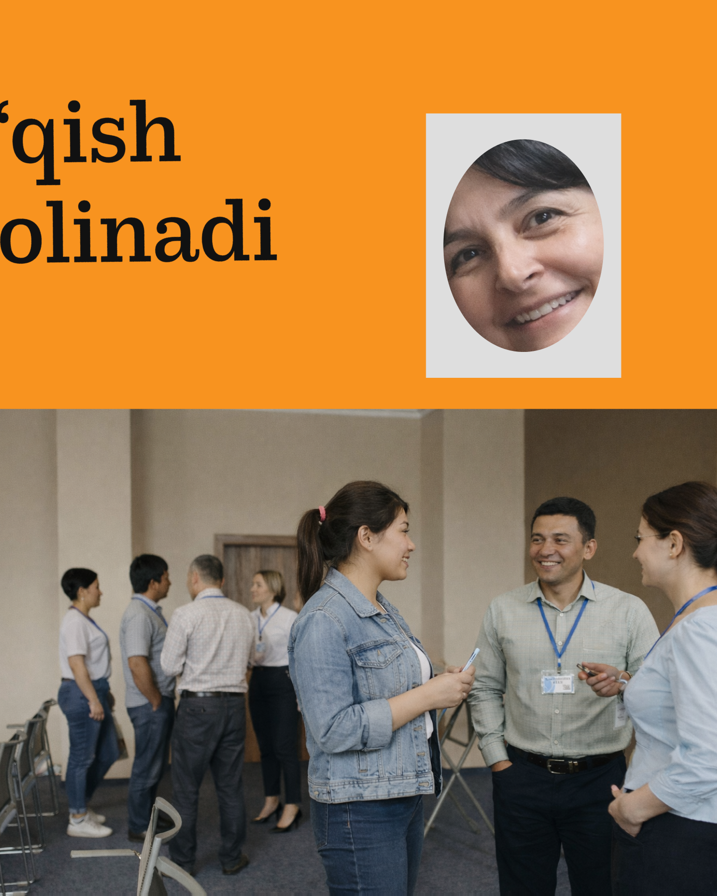
As for the design strategy, affordability and approachability come first. The photography has no style by design. It looks like it was taken by your qaynona and sent via WhatsApp. Videos are recorded on site, on an Android phone. Loose, “lazy” collages become a feature rather than a shortcut, allowing illustration production to stay quick and playful. The whole system is carefully balanced to avoid any try-hard energy, while never tipping into actual cheap feel.
⑤
The web media, art-directed by Taradash and myself, is built somewhere between utilitarian and soft brutalist. Including non-Uzbekistani collaborators was a smart move by the leadership team. It helps the project stand out within the local digital design landscape, while also keeping aggressive visual thinking in check through constant dialogue with the local team.
Great thanks to the design collaborators, the NECHPUL editorial office, and TBC Uzbekistan leadership for making this project possible.